Replicating Google's Drawer Headers

Overview

Today I’m going to go over how to replicate the header you find at the top of the Google app drawers. If you haven’t already, you can check out the previous walkthrough on how to set up your drawer in the first place. It can be found here: Create Material Design Navigation Drawer

Dependencies

First thing you are going to need is to set up a layout that will be the header for the drawer. I personally use Piccaso to load the images. You can either use a custom transform to change the user image to a circle or you can use a circle image view. I chose the circle image view since it makes the default image circle as well. For both of these add these two dependencies to your application build.gradle:

compile 'com.squareup.picasso:picasso:+'
compile 'de.hdodenhof:circleimageview:+'

The ‘+’ are where the version numbers go. You can leave it this way but android studio will throw a warning about them.

Layout Creation

Now I use the same layout for both 21 and previous so mine looks like this:

<RelativeLayout
    xmlns:android="http://schemas.android.com/apk/res/android"
    xmlns:app="http://schemas.android.com/apk/res-auto"
    android:layout_width="match_parent"
    android:layout_height="178dp">

    <ImageView
        android:id="@+id/banner_image"
        android:layout_width="match_parent"
        android:layout_height="match_parent"
        android:adjustViewBounds="true"
        android:background="@android:color/darker_gray"
        android:src="@drawable/bg_default_profile_art"/>

    <de.hdodenhof.circleimageview.CircleImageView
        android:id="@+id/user_image"
        android:layout_width="70dp"
        android:layout_height="70dp"
        android:layout_marginTop="38dp"
        android:layout_marginStart="16dp"
        app:border_width="2dp"
        app:border_color="#ffffff"
        android:src="@drawable/ic_profile_none"/>

    <RelativeLayout
        android:layout_alignBottom="@+id/banner_image"
        android:layout_width="match_parent"
        android:layout_height="48dp">

        <RelativeLayout
            android:layout_marginStart="16dp"
            android:layout_width="wrap_content"
            android:layout_height="wrap_content"
            android:layout_centerVertical="true">

            <TextView
                android:id="@+id/user_name"
                android:layout_width="wrap_content"
                android:layout_height="wrap_content"
                android:textColor="@android:color/primary_text_dark"
                android:textSize="14sp"
                android:textStyle="bold"/>

            <TextView
                android:id="@+id/user_account"
                android:layout_below="@id/user_name"
                android:textColor="@android:color/secondary_text_dark"
                android:layout_width="wrap_content"
                android:layout_height="wrap_content"
                android:textStyle="normal"
                android:textSize="14sp"/>

        </RelativeLayout>

    </RelativeLayout>

</RelativeLayout>

Insert Header into Drawer

The header then needs to be added into your drawer inside of your activity. This needs to be done BEFORE you attach an adapter to your listview.

Go to your activity with the drawer and find the onCreate method. I would recommend to make a private member variable for your header since we will be populating it after you have finished logging into the Google Account. We will then find and set the header for the drawer. (Now remember some of this code you probably recognize from the previous walkthrough so make sure it is in this order)

Once you add in you default profile picture, default banner picture, and an adapter (adapter must be set for the header to become visible) you can run this and you should see your header. Now all we have to do is hook up your Google account to it.

Populating Drawer with user’s Google Account

Now for the fun part. In your main activity where your drawer is going to be we need to set up a log in for the Google Api Client. On connection we will then pull the current person’s name, email, banner image, and profile image. What we need to do is set up some implementations for the callbacks (failed and success) and a couple more override classes. Eventually your main activity should look something like this:

public class MainActivity extends AppCompatActivity implements GoogleApiClient.ConnectionCallbacks, GoogleApiClient.OnConnectionFailedListener {
    private ActionBarDrawerToggle mDrawerToggle;
    private DrawerLayout mDrawerLayout;
    private ListView mDrawerList;
    private FragmentManager mFragmentManager;
    private View mHeaderView;

    private static final int REQUEST_RESOLVE_ERROR = 1001;

    private GoogleApiClient mGoogleApiClient;
    private boolean mResolvingError = false;

    @Override
    protected void onCreate(Bundle savedInstanceState) {
        super.onCreate(savedInstanceState);
        setContentView(R.layout.activity_main);

        Toolbar toolbar = (Toolbar) findViewById(R.id.main_toolbar);
        setSupportActionBar(toolbar);

        mHeaderView = getLayoutInflater().inflate(R.layout.user_header_layout, null);
        mFragmentManager = getSupportFragmentManager();

        mGoogleApiClient = buildGoogleApiClient();
        mGoogleApiClient.connect();

        mDrawerList = (ListView) findViewById(R.id.drawer_listview);
        mDrawerLayout = (DrawerLayout) findViewById(R.id.drawer_layout);
        mDrawerToggle = new ActionBarDrawerToggle(this, mDrawerLayout, toolbar,
                R.string.open, R.string.close);
        mDrawerToggle.setDrawerIndicatorEnabled(true);
        mDrawerLayout.setDrawerListener(mDrawerToggle);
        mDrawerList.addHeaderView(mHeaderView);

        // set adapter
        // set onitemclicklistener

    }

    //item click listener

    public GoogleApiClient buildGoogleApiClient() {
        return new GoogleApiClient.Builder(this)
                .addConnectionCallbacks(this)
                .addOnConnectionFailedListener(this)
                .addApi(Plus.API)
                .addScope(Plus.SCOPE_PLUS_LOGIN)
                .build();
    }

    @Override
    protected void onPostCreate(Bundle savedInstanceState) {
        super.onPostCreate(savedInstanceState);
        mDrawerToggle.syncState();
    }

    @Override
    public void onConfigurationChanged(Configuration newConfig) {
        super.onConfigurationChanged(newConfig);
        mDrawerToggle.onConfigurationChanged(newConfig);
    }

    @Override
    public void onBackPressed() {
        if(mDrawerLayout.isDrawerOpen(Gravity.START|Gravity.LEFT)){
            mDrawerLayout.closeDrawers();
            return;
        }

        super.onBackPressed();
    }

    @Override
    public void onConnectionFailed(ConnectionResult result) {
        if (mResolvingError) {
            // Already attempting to resolve an error.
            return;
        } else if (result.hasResolution()) {
            try {
                mResolvingError = true;
                // start and activity to try and fix the login error
                result.startResolutionForResult(this, REQUEST_RESOLVE_ERROR);
            } catch (IntentSender.SendIntentException e) {
                // try logging in again
                mGoogleApiClient.connect();
            }
        } else {
            mResolvingError = true;
        }
    }

    @Override
    protected void onActivityResult(int requestCode, int resultCode, Intent data) {
        // response from the activity launched by login to get user input
        // to successfully log in
        if (requestCode == REQUEST_RESOLVE_ERROR) {
            mResolvingError = false;
            if (resultCode == RESULT_OK) {
                if (!mGoogleApiClient.isConnecting() && !mGoogleApiClient.isConnected()) {
                    mGoogleApiClient.connect();
                }
            }
        }

        super.onActivityResult(requestCode, resultCode, data);
    }

    @Override
    public void onConnectionSuspended(int cause) {
        mGoogleApiClient.connect();
    }

    @Override
    public void onConnected(Bundle bundle) {
        // get current users account
        Person user = Plus.PeopleApi.getCurrentPerson(mGoogleApiClient);
        if (user != null) {
            // if the user has a profile image
            if (user.getImage().hasUrl()) {
                String portrait = user.getImage().getUrl();
                //load into the portrait imageview
                Picasso.with(this)
                        //remove parameters since the image url makes the image really small
                        .load(portrait.split("\\?")[0])
                        .into((ImageView) mHeaderView.findViewById(R.id.user_image));
            }

            // load the banner into the background
            Picasso.with(this)
                    .load(user.getCover().getCoverPhoto().getUrl())
                    .into((ImageView) mHeaderView.findViewById(R.id.banner_image));

            // set the account name
            ((TextView) findViewById(R.id.user_account))
                    .setText(Plus.AccountApi.getAccountName(mGoogleApiClient));

            // set the user's name
            Person.Name userName = user.getName();
            ((TextView) findViewById(R.id.user_name))
                    .setText(String.format("%s %s", userName.getGivenName(), userName.getFamilyName()));
        }
    }

    @Override
    protected void onStart() {
        super.onStart();
    }

    @Override
    protected void onStop() {
        super.onStop();
        if (mGoogleApiClient.isConnected()) {
            mGoogleApiClient.disconnect();
        }
    }
}

Success

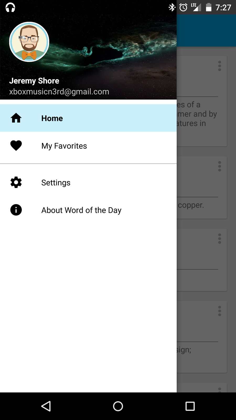
Now you should be able to run and see your new drawer header! Personal note I tend to like to make this the main activity and have fragments and controllers for navigation throughout everything so you only have to worry about logging in once and the drawer is always there (but that is just me).

Once you have an adapter added to this, your drawer should look something like this:

Drawer Example Screenshot

Create Material Design Navigation Drawer

Overview

Currently at the moment there isn’t really a guide on how to get a fully material design compliant drawer on android 5.0. So this is going to be a walkthrough on how to do exactly that.

Setup

Your targeting api should probably be v21+ (or android 5.0+) and you can either do no activities or a blank activity. You will want to immediately check out your build.gradle and make sure you have the appcompat dependency is in there. (Note: this is usually automatically included for you).

// + is where the version is (or leave it so it auto updates for you)
compile 'com.android.support:appcompat-v7:+'

Along with making sure your main theme is an AppCompat theme, not the device default theme.Inside of that theme make sure you have windowActionBar set to false.

<item name="windowActionBar">false</item>

Replacing the ActionBar

Lets start with how to get the drawer out from under the action bar. By default when you add a drawer to your application it will appear under your action bar. To rectify this, you need to use a toolbar instead of the default ActionBar. When you added windowActionBar to your theme, you where actually turning that actionbar off. To get back that actionBar we need to change the activity to AppCompatActivity.

public class MainActivity extends AppCompatActivity {
    @Override
    protected void onCreate(Bundle savedInstanceState) {
        super.onCreate(savedInstanceState);
        setContentView(R.layout.activity_main);
    }
}

Now that our activity extends AppCompatActivity we need to go and add a Toolbar to this activity’s layout. It should look something like this:

<LinearLayout
    xmlns:android="http://schemas.android.com/apk/res/android"
    xmlns:app="http://schemas.android.com/apk/res-auto"
    xmlns:tools="http://schemas.android.com/tools"
    android:orientation="vertical"
    android:layout_width="match_parent"
    android:layout_height="match_parent">

    <android.support.v7.widget.Toolbar
        android:background="?attr/colorPrimary"
        android:elevation="4dp"
        android:id="@+id/main_toolbar"
        android:layout_height="wrap_content"
        android:layout_width="match_parent"
        android:minHeight="?attr/actionBarSize"
        app:theme="@style/ToolbarOverlay"
        app:popupTheme="@style/PopupOverlay">

    </android.support.v7.widget.Toolbar>

    <FrameLayout
        android:id="@+id/content_frame"
        android:layout_width="fill_parent"
        android:layout_height="fill_parent">

    </FrameLayout>

</LinearLayout>

We have the Toolbar in our layout, but now we need to hook it up to your activity. So add this to your onCreate method.

Toolbar toolbar = (Toolbar) findViewById(R.id.main_toolbar);
setSupportActionBar(toolbar);

The last thing that is missing for our Toolbar is the styles. This consists of things like background color, popover color, height, button styles, etc. The next style is for v21 only. You’ll want use this in a styles-v21.xml file.

<resources>

    <style name="AppTheme" parent="Theme.AppCompat.Light.NoActionBar">
        <item name="colorPrimary">@color/main_blue</item>
        <item name="colorPrimaryDark">@color/main_blue_dark</item>
        <item name="colorAccent">@color/main_blue</item>
        <item name="colorControlHighlight">@color/main_blue</item>
        <item name="android:windowNoTitle">true</item>
        <item name="drawerArrowStyle">@style/DrawerArrowStyle</item>
        <item name="windowActionModeOverlay">true</item>
    </style>

    <!--used to have the arrow animation for the hamburger button-->
    <style name="DrawerArrowStyle" parent="Widget.AppCompat.DrawerArrowToggle">
        <item name="spinBars">true</item>
        <item name="color">@android:color/white</item>
    </style>

    <!--styles the toolbar to this color and font color-->
    <style name="ToolbarOverlay" parent="Theme.AppCompat.Light">
        <item name="android:textColorPrimary">@color/white</item>
        <item name="colorPrimary">@color/main_blue</item>
        <item name="android:textColorSecondary">@color/white</item>
    </style>

    <!--this is used for styling the popup like from the three dots on the right-->
    <style name="PopupOverlay" parent="Theme.AppCompat.Light">

    </style>

</resources>

Setup the Navigation Drawer

First, we need to add in the drawer to our layout. So make your main activity’s layout look something like this:

<RelativeLayout
    xmlns:android="http://schemas.android.com/apk/res/android"
    xmlns:app="http://schemas.android.com/apk/res-auto"
    xmlns:tools="http://schemas.android.com/tools"
    android:layout_width="match_parent"
    android:layout_height="match_parent"
    android:animateLayoutChanges="true">

    <android.support.v4.widget.DrawerLayout
        android:id="@+id/drawer_layout"
        android:fitsSystemWindows="true"
        android:elevation="5dp"
        android:layout_width="match_parent"
        android:layout_height="match_parent">

        <!-- The main content view -->
        <LinearLayout
            android:orientation="vertical"
            android:layout_width="match_parent"
            android:layout_height="match_parent">

            <android.support.v7.widget.Toolbar
                android:background="?attr/colorPrimary"
                android:elevation="4dp"
                android:id="@+id/main_toolbar"
                android:layout_height="wrap_content"
                android:layout_width="match_parent"
                android:minHeight="?attr/actionBarSize"
                app:theme="@style/ToolbarOverlay"
                app:popupTheme="@style/PopupOverlay">

            </android.support.v7.widget.Toolbar>

            <FrameLayout
                android:id="@+id/content_frame"
                android:layout_width="fill_parent"
                android:layout_height="fill_parent">

            </FrameLayout>


        </LinearLayout>

        <!-- The navigation drawer -->
        <ListView
            android:id="@+id/drawer_listview"
            android:layout_width="fill_parent"
            android:layout_height="match_parent"
            android:minHeight="?android:attr/listPreferredItemHeight"
            android:fitsSystemWindows="true"
            android:divider="@null"
            android:dividerHeight="0dp"
            android:headerDividersEnabled="true">

        </ListView>

    </android.support.v4.widget.DrawerLayout>

</RelativeLayout>

We have the layout, but now we need to hook it up inside the activity. So we need to add in handling back button, configuration changes, and toggling. You main activity should start to look something like this:

public class MainActivity extends AppCompatActivity {

    @Override
    protected void onCreate(Bundle savedInstanceState) {
        super.onCreate(savedInstanceState);
        setContentView(R.layout.activity_main);

        Toolbar toolbar = (Toolbar) findViewById(R.id.main_toolbar);
        setSupportActionBar(toolbar);

        mDrawerList = (ListView) findViewById(R.id.drawer_listview);
        mDrawerLayout = (DrawerLayout) findViewById(R.id.drawer_layout);
        mDrawerToggle = new ActionBarDrawerToggle(this, mDrawerLayout, toolbar,
                R.string.open, R.string.close);
        mDrawerToggle.setDrawerIndicatorEnabled(true);
        mDrawerLayout.setDrawerListener(mDrawerToggle);
    }

    @Override
    protected void onPostCreate(Bundle savedInstanceState) {
        super.onPostCreate(savedInstanceState);
        mDrawerToggle.syncState();
    }

    @Override
    public void onConfigurationChanged(Configuration newConfig) {
        super.onConfigurationChanged(newConfig);
        mDrawerToggle.onConfigurationChanged(newConfig);
    }

    @Override
    public void onBackPressed() {
        if(mDrawerLayout.isDrawerOpen(Gravity.START|Gravity.LEFT)){
            mDrawerLayout.closeDrawers();
            return;
        }

        super.onBackPressed();
    }
}

With this, your navigation drawer will now but up to the bottom of your status bar. However, in the material design principles they make it clear they want a transparent status bar to draw OVER the drawer.

Making the Drawer full Application Height

If you are making a non 5.0 app this section isn’t required because it isn’t supported until v21

First you will need to set up a couple of properties in a special styles-v21.xml file so that we can force it to be full screen. You should only need windowDrawsSystemBarBackgrounds but I like to set a couple other transitions and stuff so set these:

<resources>

    <!--added specifically for handling material design transitions and full window view-->
    <style name="AppTheme" parent="AppTheme.Base">
        <item name="android:windowDrawsSystemBarBackgrounds">true</item>
        <item name="android:statusBarColor">#33000000</item>
        <item name="android:windowContentTransitions">true</item>
        <item name="android:windowAllowEnterTransitionOverlap">true</item>
        <item name="android:windowAllowReturnTransitionOverlap">true</item>
        <item name="android:windowSharedElementEnterTransition">@android:transition/move</item>
        <item name="android:windowSharedElementExitTransition">@android:transition/move</item>
    </style>

    <style name="AppTheme.Base" parent="Theme.AppCompat.Light.NoActionBar">
        <item name="windowActionBar">false</item>
        <item name="colorPrimary">@color/main_blue</item>
        <item name="colorPrimaryDark">@color/main_blue_dark</item>
        <item name="colorAccent">@color/main_blue</item>
        <item name="colorControlHighlight">@color/transparent_main_blue</item>
        <item name="android:windowNoTitle">true</item>
        <item name="drawerArrowStyle">@style/DrawerArrowStyle</item>
        <item name="windowActionModeOverlay">true</item>
    </style>

    <style name="DrawerArrowStyle" parent="Widget.AppCompat.DrawerArrowToggle">
        <item name="spinBars">true</item>
        <item name="color">@android:color/white</item>
    </style>

    <style name="ToolbarOverlay" parent="Theme.AppCompat.Light">
        <item name="android:textColorPrimary">@color/white</item>
        <item name="colorPrimary">@color/main_blue</item>
        <item name="android:textColorSecondary">@color/white</item>
    </style>

    <style name="PopupOverlay" parent="Theme.AppCompat.Light">

    </style>

</resources>

With those styles, you just need to make sure the DrawerLayout in your main activity has the fitsSystemWindow attribute set to true. This should make the drawer go your status bar correctly. There is one problem though. Since the status bar is being drawn there android assumes you don’t want your content to start until under your status bar. So if you put an image on the top for the header (like Google does), you would get a white bar above it. So to fix this you need to add in a custom layout called ScrimInsetsFrameLayout which insets the view to get rid of that white bar. That class can be found in this gist:

Now just go and update the layout for your activity to use this layout to get a result somewhat like this:

<RelativeLayout
    xmlns:android="http://schemas.android.com/apk/res/android"
    xmlns:app="http://schemas.android.com/apk/res-auto"
    xmlns:tools="http://schemas.android.com/tools"
    android:layout_width="match_parent"
    android:layout_height="match_parent"
    android:animateLayoutChanges="true">

    <android.support.v4.widget.DrawerLayout
        android:id="@+id/drawer_layout"
        android:fitsSystemWindows="true"
        android:elevation="5dp"
        android:layout_width="match_parent"
        android:layout_height="match_parent">

        <!-- The main content view -->
        <LinearLayout
            android:orientation="vertical"
            android:layout_width="match_parent"
            android:layout_height="match_parent">

            <android.support.v7.widget.Toolbar
                android:background="?attr/colorPrimary"
                android:elevation="4dp"
                android:id="@+id/main_toolbar"
                android:layout_height="wrap_content"
                android:layout_width="match_parent"
                android:minHeight="?attr/actionBarSize"
                app:theme="@style/ToolbarOverlay"
                app:popupTheme="@style/PopupOverlay">

            </android.support.v7.widget.Toolbar>

            <FrameLayout
                android:id="@+id/content_frame"
                android:layout_width="fill_parent"
                android:layout_height="fill_parent">

            </FrameLayout>


        </LinearLayout>


        <!-- The navigation drawer -->
        <com.w9jds.EveProfiler.Widgets.ScrimInsetsFrameLayout
            xmlns:app="http://schemas.android.com/apk/res-auto"
            android:id="@+id/scrimInsetsFrameLayout"
            android:layout_width="308dp"
            android:layout_height="match_parent"
            android:layout_gravity="start"
            android:elevation="10dp"
            android:background="@color/white"
            android:fitsSystemWindows="true"
            app:insetForeground="#4000">

            <ListView
                android:id="@+id/drawer_listview"
                android:layout_width="fill_parent"
                android:layout_height="match_parent"
                android:minHeight="?android:attr/listPreferredItemHeight"
                android:fitsSystemWindows="true"
                android:divider="@null"
                android:dividerHeight="0dp"
                android:headerDividersEnabled="true">

            </ListView>

        </com.fatrussell.wordoftheday.Widgets.ScrimInsetsFrameLayout>

    </android.support.v4.widget.DrawerLayout>

</RelativeLayout>

and now you have a drawer that slides under the status bar exactly how the drawer is depicted in the material design guidelines!

Replicating Android TV's Home Screen ImageCardView Info Expand

Overview

When you use the Android TV you might notice that when you focus on a card, the title area expands so you can read everything. However, if you use the ImageCardView this functionality does come baked in. So I will show you how to set up the OnFocusChangeListener to mimic this functionality.

Gist with Required Code

Feel free to adjust the amount of lines to display. This utilizes using a wrap content layout so it automatically expands when a layout parameter changes. If you really want to go a step farther and make it fancier I’m sure you could use a ValueAnimator to use an Interpolator to slide it open and have it use requestLayout(). If you do go that route you will need to render the content manually to get the bounds so you know how much to slide open.

Example in action

Title Expand